


After watching this video, you will know how to compare weekly and daily page layout options for your Brookebot Digital Planner.
Hi, I’m Brooke of brookebot.com. This is the second of 3 videos in a series outlining the key features and functions of Brookebot Digital Planners. In the first video we tap dated links to navigate through planner pages quickly & in the third video we explore supplementary pages including storage sections, bookmark dividers and all kinds of digi paper.
In this video, we will not be tapping on any links. I’ll mention where the links are located on the page, but you’ll need to watch the first & the third video in this series to see links in action. The point of this video is to visually examine the page designs of 6 weekly & 4 daily layout options. We will compare the similarities and differences between them in an effort to help you make a decision about which layouts best suit your needs.
Let’s go ahead and dive into the weekly page design options.
You’ll need to choose 1 of 6 different weekly layouts. First let’s talk about the things that all 6 of these layouts have in common. To do this, we’ll be using my favorite — the weekly BujoBoba layout. As with all layouts, you can specify the day sequence you prefer — Sunday–Saturday OR Monday–Sunday.
In the top left corner of every layout is a tiny calendar with nine weeks worth of dated links. When tapped, all of these dates lead to their respective weekly pages. The label at the top of the tiny calendar leads to the full-page monthly calendar. Then underneath the tiny calendar is a sidebar divided into 7 segments by dotted lines. If your layout is bujo-based, then each segment is filled with quad-dot grid. Otherwise, the segments will be blank. Here you can keep habit trackers, take notes or use this extra space for anything that makes sense to you.
Now let’s talk about the main section where we write our plans. No matter which layout you choose, each weekly page has 7 dated headings lining the top — with the exception of appropriately placed headings in the BujoNeemo layout. (We’ll take a look at the BujoNeemo in just a minute.) If you have a Weekly + Daily Planner, then each of these 7 dates links to the respective daily page. Remember to watch the first video in this series to see all of these links in action.
That covers the commonalities of weekly layouts. Now let’s talk about the differences between the planning areas of each layout.
The planning area of the BujoBoba layout is very versatile. It’s a wide-open space filled with quad-dot grid & gives you the freedom to create your own unique layouts from week to week. This is why it is my favorite. Considering I’ll be married to my planner for a full year, I like to know that I’ll have the option to experiment as my workflow evolves. Though for some, this kind of free-range space isn’t always desirable & can be a little overwhelming. There are lots of people who prefer to have a more structured page layout with built-in frames. So, let’s work our way through the 6 weekly layouts & explore your range of options.
The planning area of the Flamingo layout has 7 columns — one for each day of the week. Each of the columns is divided into 3 blank segments by 2 dotted lines. The Flamingo layout is not a bujo-based layout, so there is no quad-dot grid in the columns or in the sidebar. Labeling the 3 boxes morning, afternoon, and evening for each day is a very popular planning method. Though you may prefer to use these boxes in a different way, so they are without labels intentionally. Perhaps you’d want to use one for meal planning, one for a checklist, and one for various notes — whatever works best for you.
The planning area of the BujoBunny layout is made of 7 unsegmented columns filled with quad-dot grid — the columns are not divided into 3 parts like the Flamingo. You’ll notice the sidebar is also filled with quad-dot grid. If the BujoBoba layout and the Flamingo layout had a baby, it would be the BujoBunny — inheriting traits from both. If you find yourself struggling to choose between the BujoBoba and the Flamingo, then the BujoBunny might be just right for you.
The planning area of the BujoNeemo layout has a bit of a different feel. Here we have 7 horizontal boxes with day heading labels for each. The bottom portion of each box is filled with quad-dot grid. The weekend boxes for Saturday & Sunday are half-sized. This layout is special in that it is only available with the day sequence of Monday–Sunday. If it existed, the BujoNeemo layout with a weekly day sequence of Sunday – Saturday would display Sunday in a full box and Friday & Saturday in half-boxes. If you think about it, that just wouldn’t make a whole lot of sense.
The planning area of the Panda layout is the weekly hourly option with 24-hour time notation. Each of the 7 columns is divided into 17 hours. The hours range from the morning hour of 0600 at the top of each column to the evening hour of 2300 at the bottom. Each hour is divided into 4 parts so that you can easily mark tasks and appointments in 15 minute increments if you wish.
The planning area of the PeachyKeen layout is exactly like the Panda layout that we just examined. The difference is that the PeachyKeen layout has 12-hour time notation. It ranges from the morning hour of 6AM at the top of the column to the evening hour of 11PM at the bottom.
When customizing a Weekly + Daily planner, there is an hourly option available for both the weekly pages and for the daily pages. So, if you are considering any type of hourly layout, take a little time to think about how you’ll use your weekly and daily pages together. The 2 layouts you choose should compliment each other, your workflow and your planning style.
Now you’ve seen all the weekly layouts. Let’s take a look at your daily layout options.
You’ll need to choose 1 of 4 daily layout options. First let’s talk about the things that all 4 of these layouts have in common. To do this, we’ll be using my favorite — the daily BujoBanana layout.
At the top of every daily page is the day of the week, the month (in 2 places), the numbered date, the year, and 2 weeks worth of dated links — one week before the day in current view & one week after. All of these elements are linked to other pages within the planner. To see what happens when these links are tapped, be sure to watch the first video in this series. In that video we also go over a pretty neat thing you can do with the first and last dated links in this 2 week line-up.
Let’s take a look at the differences between the planning areas of the daily page designs.
The planning area of the BujoBanana layout is very versatile. It is a wide-open space filled with quad-dot grid & gives you the freedom to create your own unique layouts from day to day.
The planning area of the BujoDreamie layout is also very versatile, but has built-in page divisions for more structure. There are 2 sidebars — one on the left and one on the right. Each sidebar is divided into 9 segments & filled with quad-dot grid. Then in the middle are 3 larger sections filled with quad-dot grid.
The Cupcake layout is the hourly option with 24-hour time notation. There are 3 main sections in the planning area. The section on the left is the hourly section ranging from 0600 at the top of the column to 2300 at the bottom. Each hour is divided into 4 parts so that you can use 15 minute increments if you wish. In the middle is the task list section with 12 segments — each with 3 ruled lines and a checkbox. On the right side is a dot-lined area for keeping detailed notes or daily journals.
The Cactus layout is exactly like the Cupcake layout with the hourly section, the task section, and the dot-lined area that we just examined. The difference is that the Cactus layout has 12-hour time notation. It ranges from 6AM at the top of the column to 11PM at the bottom.
In this video we examined a total of 10 page designs — 6 weekly & 4 daily layout options. Now you should have a better understanding of which layout designs might best suit your workflow and planning style.
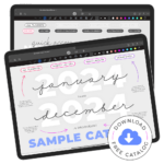
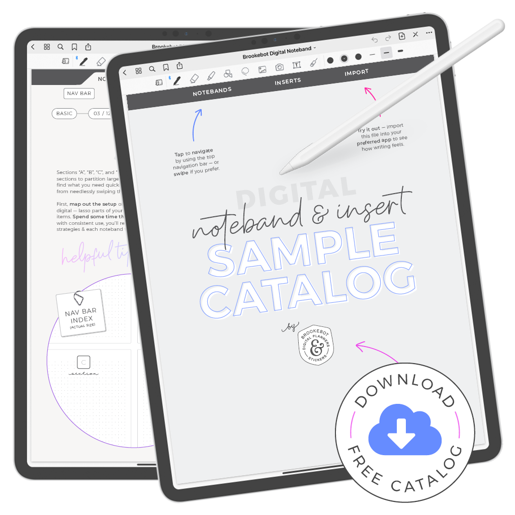
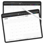
Each page layout that we cover in this video is represented in the digital planner sample catalog available to download (for free) from brookebot.com. With it you can zoom in & out, write on, and inspect page samples on your device & in your preferred note-taking app. Remember too that this was 1 in a series of 3 videos covering 2021 Brookebot Digital Planners. Be sure to watch the first video where we use dated links to help us navigate through planner pages quickly & then the third video covering storage sections, bookmark dividers and all kinds of digi paper included with your planner.
Thanks for watching! I’ll see you in the next video.